Over the last couple of years at Wildtribe, we’ve worked closely with companies across the energy transition, and I kept running into a fairly annoying problem.
It’s probably not the sort of problem you would imagine. Not climate change deniers, the oil industry or government. It was icons.
Every time I built a website, interface, or anything in between, I’d choose a suitable icon set for the client. Everything would be fine, and then all of a sudden I’d need an icon for a floating wind farm or an offshore substation.
Off I would go to Google to find some random lone illustration that, like an ex-partner, just doesn’t work.
Of course, if you aren’t a designer or developer, you might think icons are hardly the biggest problem in the renewable energy sector. Well, you would be right. But that doesn’t mean I can’t do my bit as a creative to help make the sector look just a tiny bit better.
So I kicked things off in true fashion, the same way I do with any personal side project. I thought about it for six months and did nothing.
After that bout of procrastination, I decided enough was enough and got started.
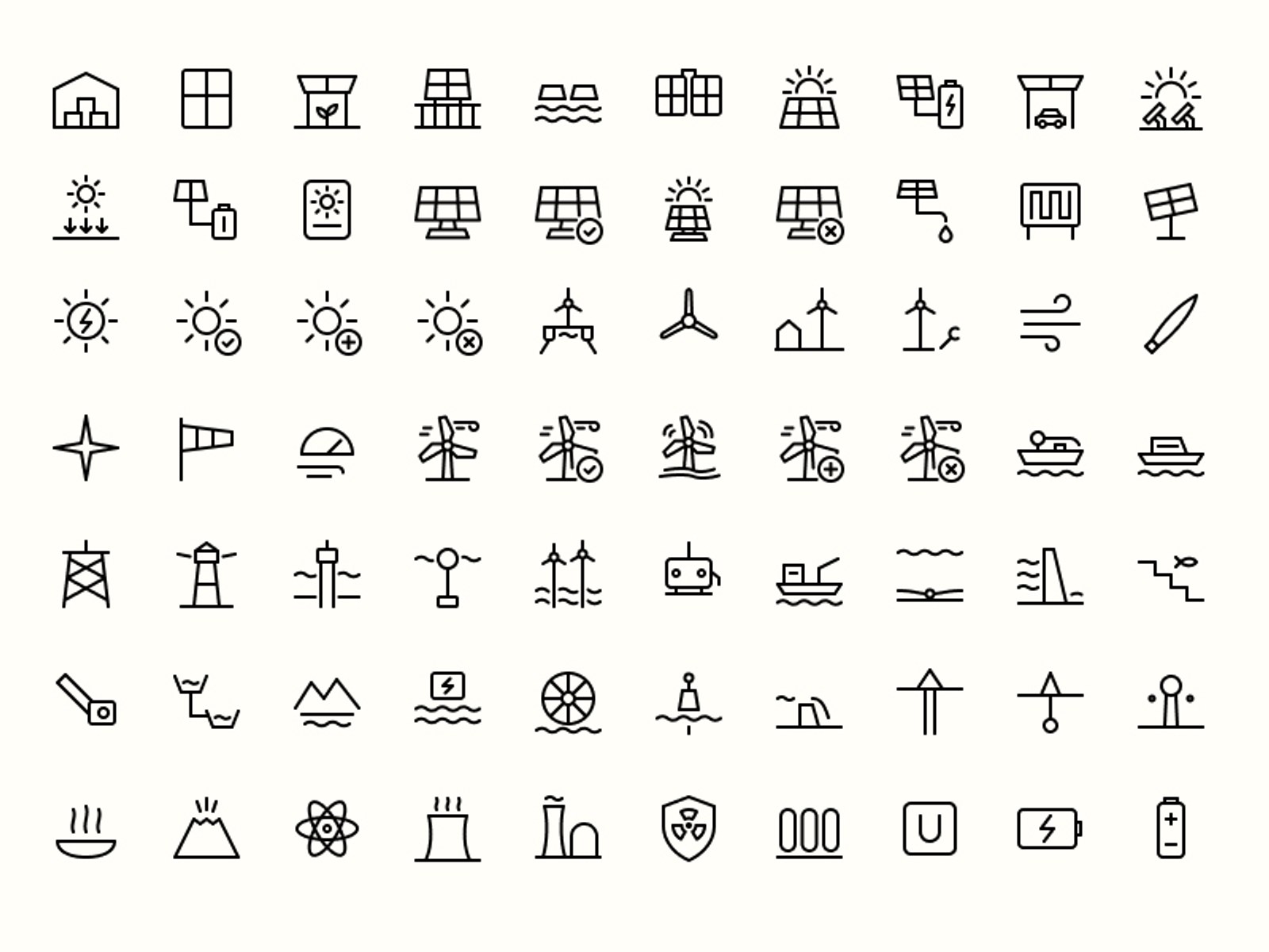
The goal was simple: make an icon set that could be used for anything, but with much deeper coverage of energy, climate and infrastructure than other sets.
The foundations
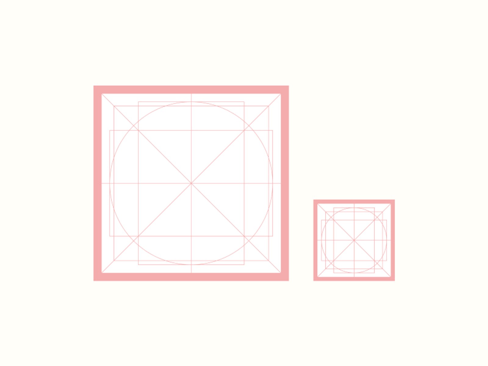
First, with any icon set you need to start with a frame template and a set of keylines. These help balance icons with completely different shapes.
You create this using a square, wide rectangle, tall rectangle, circle, and then horizontal, vertical and diagonal lines.
Basically, this keeps the entire set feeling consistent. You use the height and width rules to make taller or wider icons feel like they are the same visual size as everything else, even when technically they aren’t.
The rules
I know, you’re probably thinking this sounds a bit strict for some lines in a square. But with icons, you need strict starting rules. Without them, it’s surprisingly easy to end up with a set that feels inconsistent, doesn’t scale properly or becomes difficult to use.
I won’t go into every detail of how we got there, but these are the core rules I set for Energy Icons:
Two master sizes. Every icon is designed at 48×48px and 20×20px, rather than relying on one master to work perfectly at every size.
Consistent stroke weights. Regular icons use 2px strokes at 48px and 1px at 20px. Bold uses 2.5px and 1.25px. Stroke weights are never mixed within an icon.
Centre-aligned strokes. Strokes always sit directly on the centre of their paths.
Round where it makes sense. Free ends and turns use round caps. Where one stroke meets another, the joining end is flat to keep the connection clean.
No awkward overlaps. Strokes stop cleanly when they meet shapes rather than disappearing underneath them or creating heavier joins.
The goal isn’t to make every icon mathematically identical. The rules create a consistent starting point, then optical judgement does the rest.
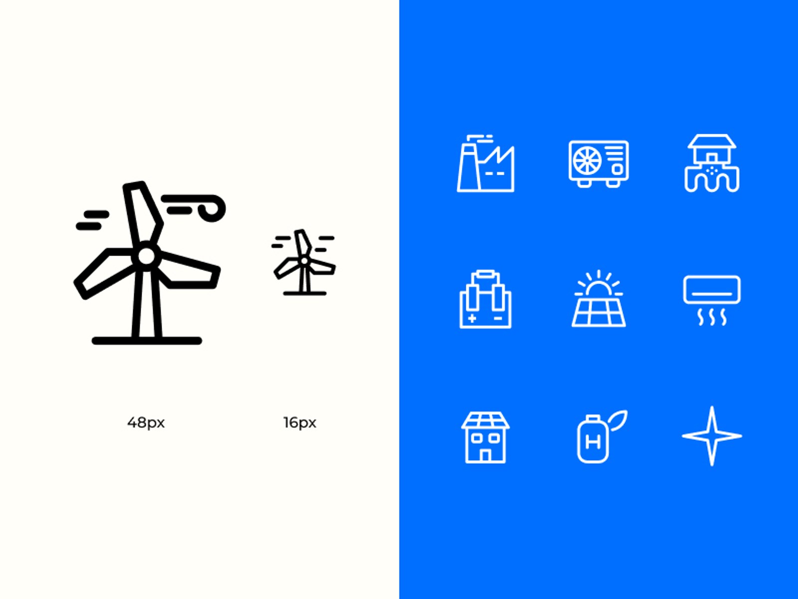
The styles
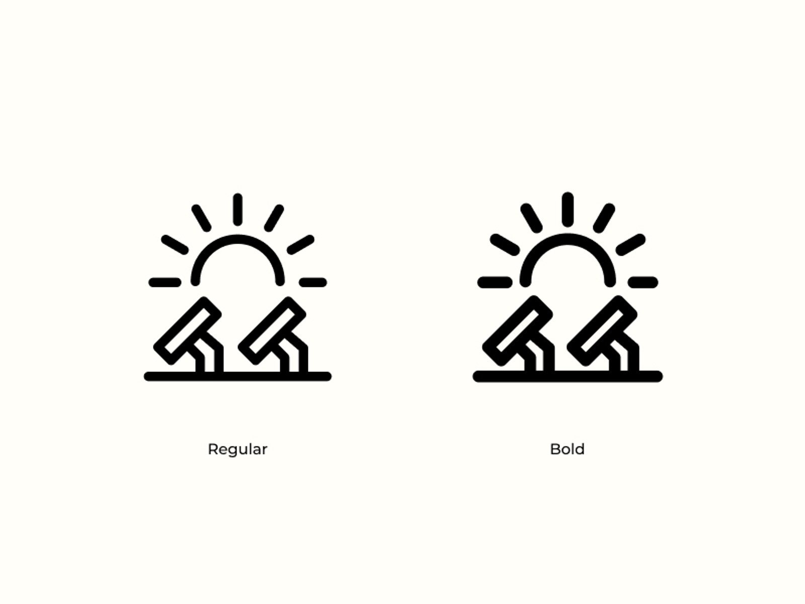
To make sure I actually shipped an MVP, I decided to build just two styles to begin with: Regular and Bold.
Following the rules above, Regular uses a 1px stroke at the smaller size and 2px at the larger size. Bold uses 1.25px and 2.5px. Anything heavier started to feel like too much.
I’m also aiming to add a filled version of every icon, as well as animations, but that’s a little further down the roadmap.
How we got to 1,000
I actually really enjoy designing icons. It can be quite therapeutic. You can get lost in one for a while or blast out loads fairly quickly.
That said, when I realised I had set 1,000 icons as my launch target, I started to realise I needed to automate some of the more generic icons to make this a genuinely usable set for all purposes.
It’s also not just designing the icons. It’s creating components, adding them to libraries, updating the website and keeping everything organised.
After designing around 150 icons by hand, I decided to see if I could build an AI workflow to speed some of this up.
At first, it looked like a no-go. Working from my screenshots alone didn’t produce anything remotely usable. But then I used MCP in Cursor to connect directly to my Figma file and started working with the agent to train it to follow the rules I had set in the document exactly.
Basically, it’s like training a dog. A really smart one.
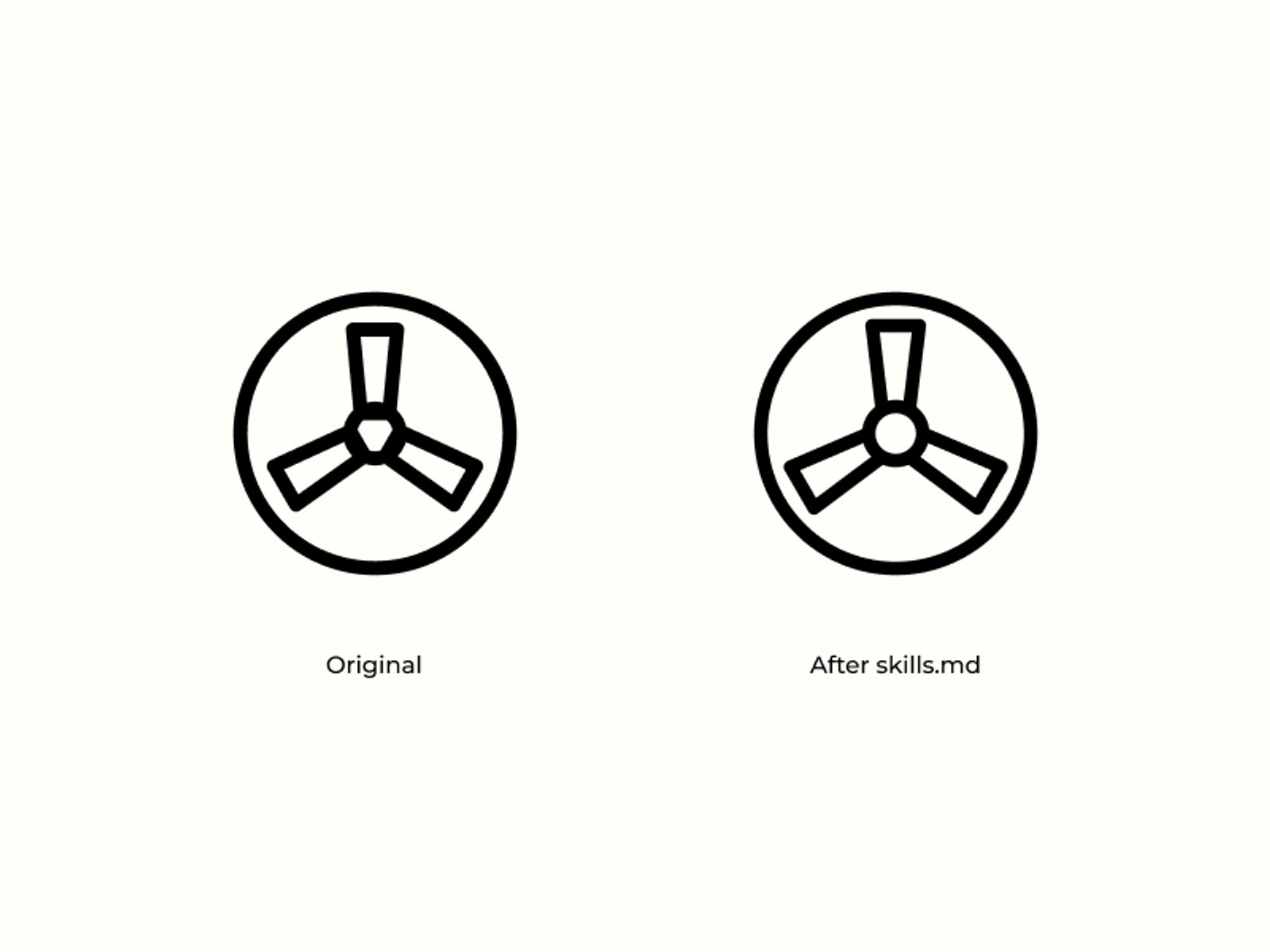
I would say, “Design X icon”, and the agent would build it horribly. I’d tell it what to fix and, more importantly, why. Every time I did that, I would turn the lesson into an agent skill.
Over time, those individual lessons became a SKILLS.md file that contributors can use when building Energy Icons with agents.
It now works with Claude, Codex and Cursor, although it still struggles with some of the more creative icons. Work in progress.
Final thoughts
So there you have it. A very distilled version of how I got to launching Energy Icons.
I’ve built what I think is a pretty nice website to house the whole thing. From there, you can browse and download the entire set, copy individual icons as SVGs, install Energy Icons into your codebase with
npm install energy-icons, or use the shiny new Figma plugin by searching for Energy Icons in the Figma Community.
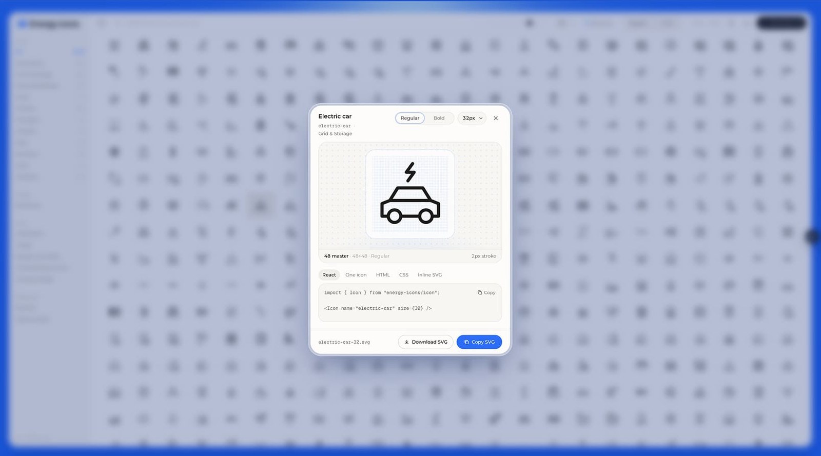
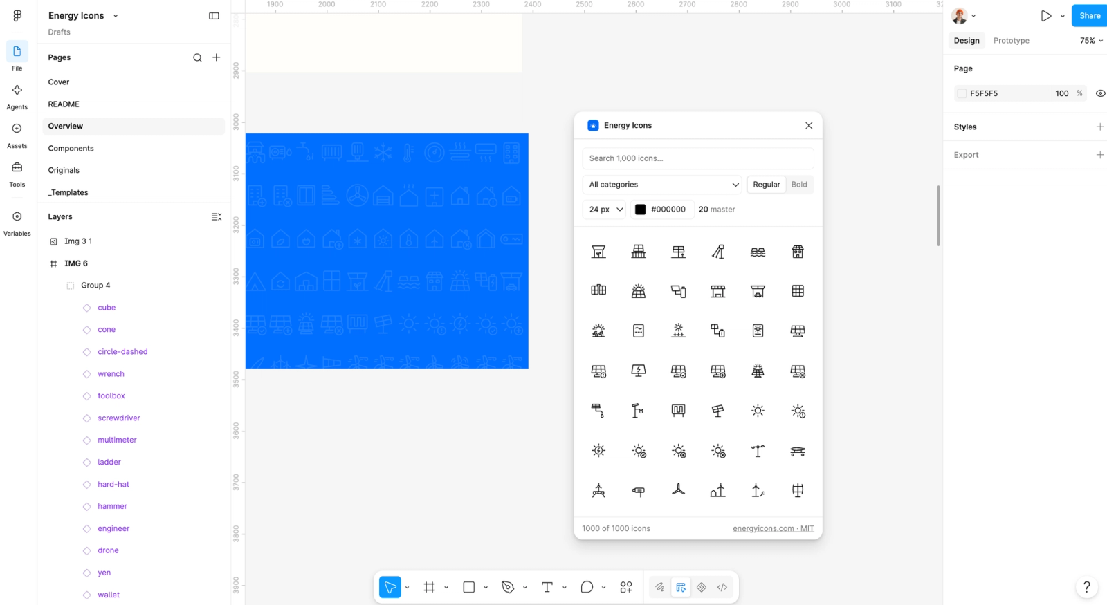
Everything is open source, so if you want to show your support, contribute an icon or help improve the project, head to the site and have a look through the docs.
And if you’re a designer or developer and think this might be useful, it would be great if you could head over to GitHub and give the project a star.
Over and out.